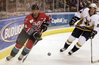
Mudbugs jerseys...lose them

I know they're the home team, and this may not go over well with their throng of fans, but the Bossier-Shreveport Mudbugs have got to get new jerseys.
Their 10th anniversary commemorative sweaters are hideous. What happened to the days of simple hockey jerseys with one dominant color? When you saw a red sweater on the ice, you knew it was Detroit or Chicago. When you saw a blue jersey, you knew it was Toronto.
The Mudbugs jerseys start off good with the bright red color, but they've got a stripe of teal along the bottom that looks awful. Teal is a good color for an ice cream truck, not a hockey player.
Yeah, teal was the "in" color for professional teams back in the 199os, but let's lose it for next season and especially in hockey. To top it off, there's a row of mudbug claws lining the bottom and around the sleeves. We already know which team the Mudbugs are. There's no need to throw claws all over it.
You know which Mudbugs jersey I really like. The one Clawed their mascot wears. "Mudbugs" printed diagonally across the sweater, just like the N.Y. Rangers.
Look at some of the jerseys around the Central Hockey League. I love Oklahoma City's home unis with the Olde English B. Simple, classy. It looks like a throwback jersey. Laredo's are good too (above).
By the way, Mudbugs forward Daniel Pegoraro has the best hockey mullet this side of Barry Melrose. Ah, for the old days when helmets weren't required. Pegoraro would look fantastic, like a latter-day Guy Lafleur with his locks fluttering on rushes up ice.


1 Comments:
I just have one question about Pegoraro's mullet -- is it feathered and lethal, a la Ben Stiller in Dodgeball?
Post a Comment
<< Home